Institutional
Harvard Business Review publication: Streamline Infographics
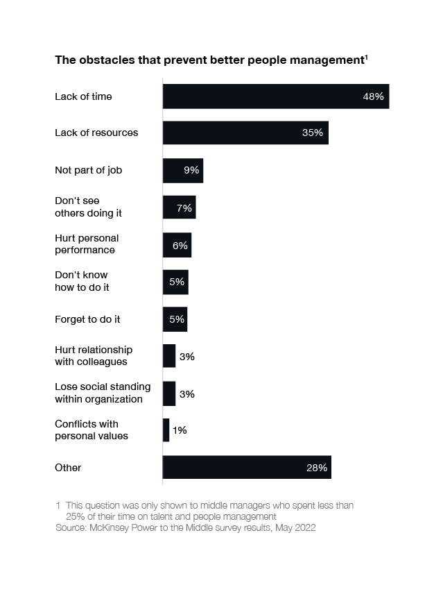
While it is convenient to use Microsoft’s built-in data visualization tools, they do not always accurately communicate your message — as demonstrated by a client who was writing a book.
Each chapter required one data visualization, and the client’s project team provided them to the editor as unfocused, cluttered PowerPoint slides. Some of them failed to support the book’s message while others required a visual that could not be created without a designer’s assistance. Additionally, the client wanted the book published in black-and-white with relatively narrow pages and the original slides did not take that into consideration.
We collaborated with the editor to align each chapter with a corresponding data visualization. After that, we redesigned each one to more accurately align with the book’s message and properly fit its specs. Our efforts amplified the overarching point of the book. Below are samples of our data visualizations from the HBR publication Power to the Middle: Why Managers Hold the Keys to the Future of Work.