Columbia Kettle Works Branding & Website Design
Building a broader brand system around an established identity
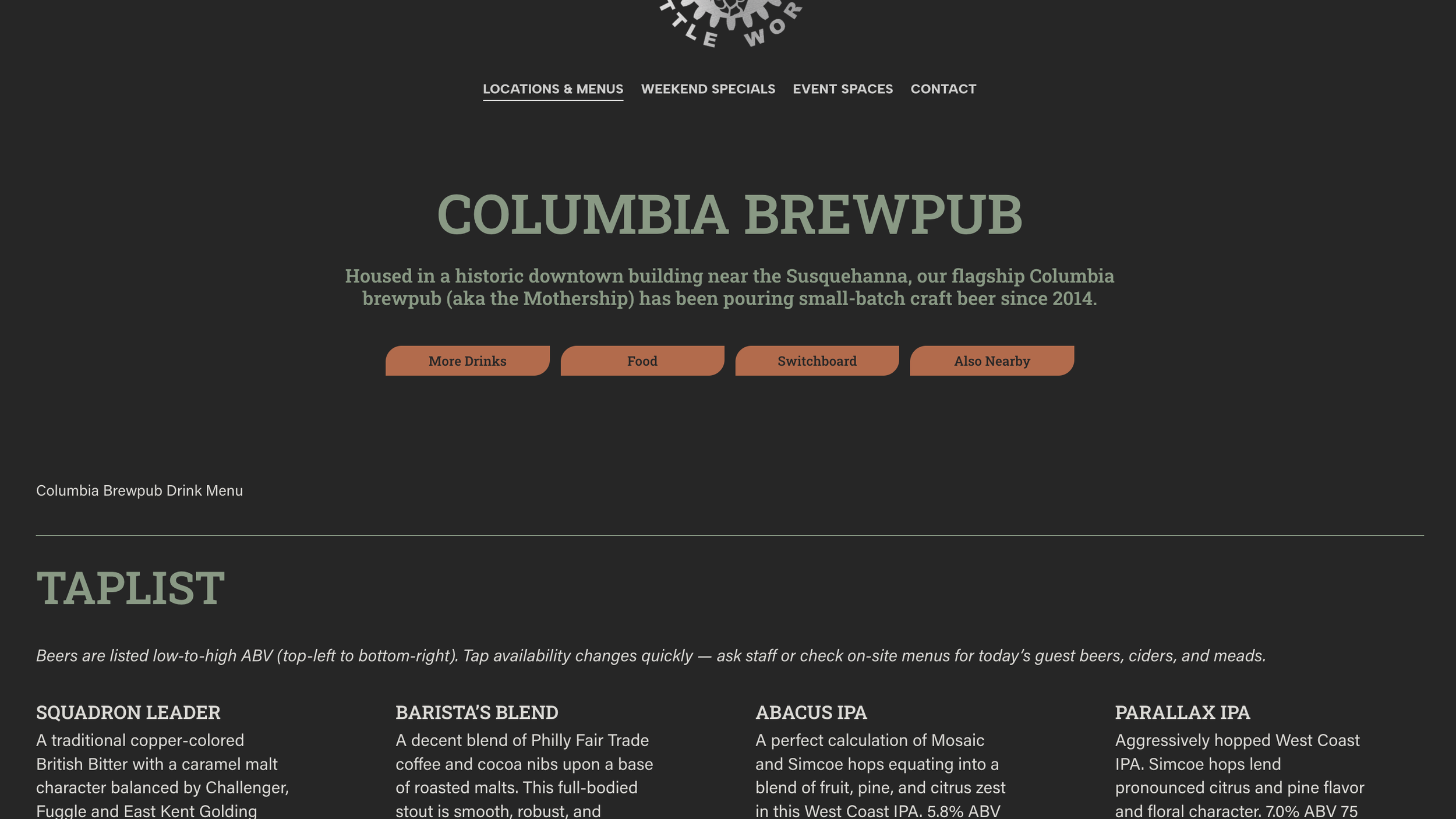
Columbia Kettle Works has an established logo that has been in use since the brewery opened in 2014. Before we began our refresh, the broader visual identity was largely limited to black backgrounds, white typography, and a red-orange accent. Rather than replace the mark, we built a more cohesive small business brand identity around it with a refreshed color palette, typography, and photography. The logo was given a metallic treatment to give it more presence.
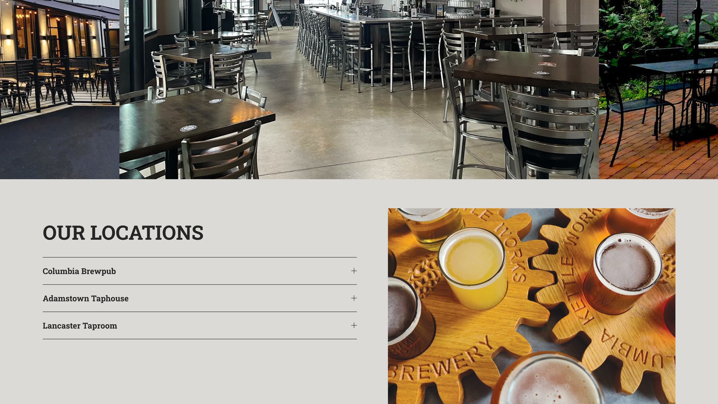
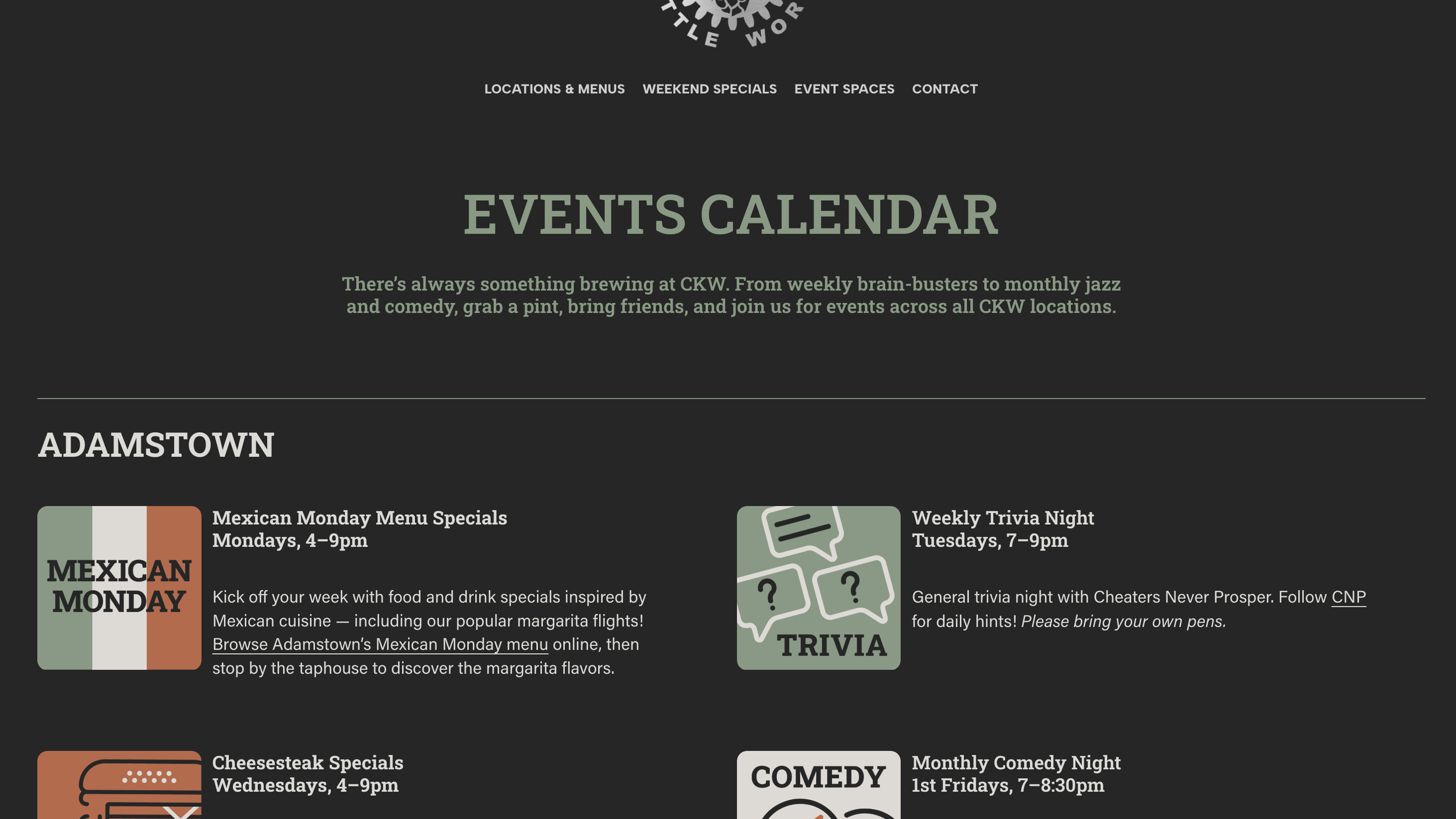
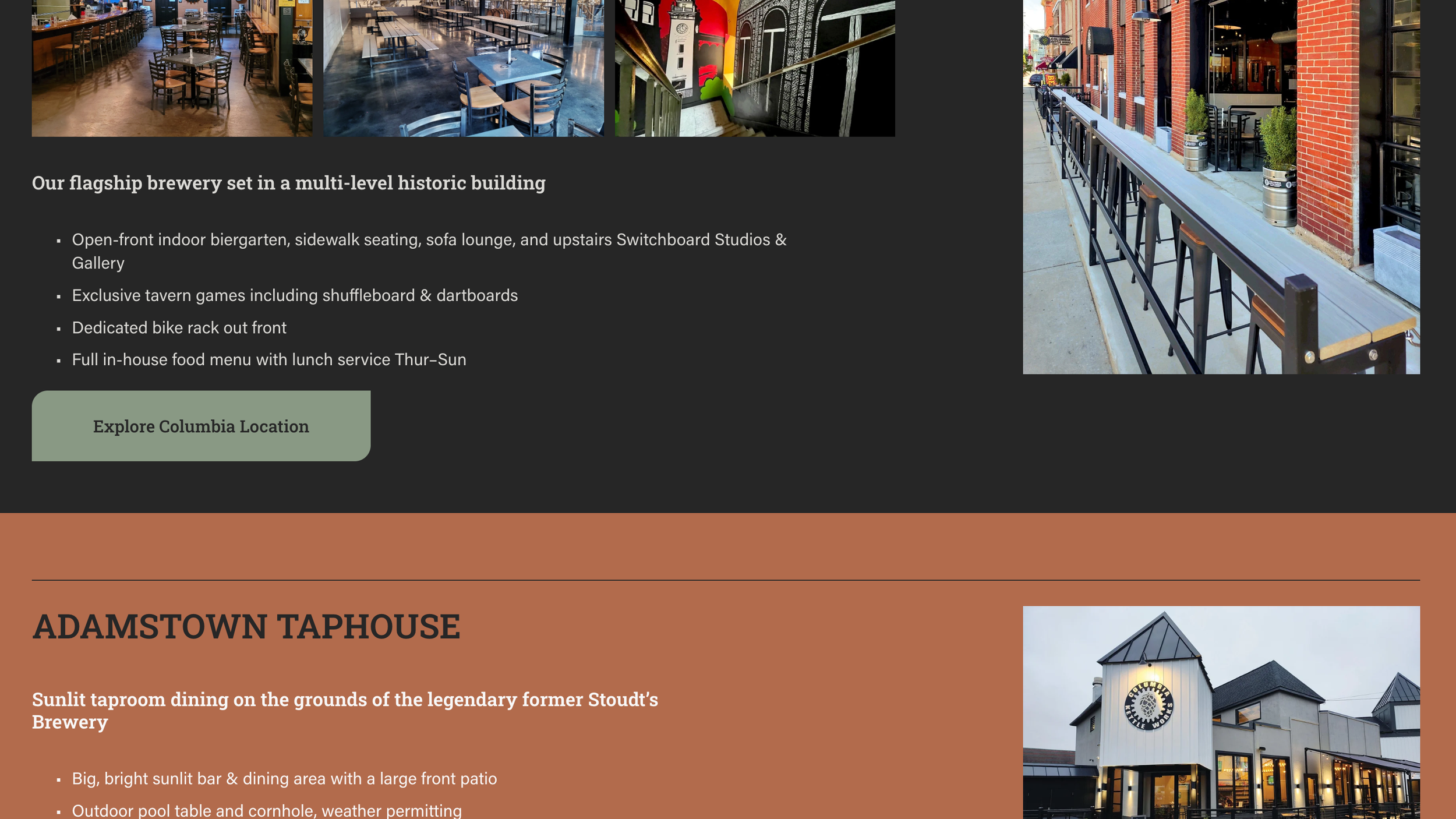
We rebuilt the website to make it more inviting and useful, simplifying the primary navigation, expanding individual location pages, and creating more robust event space information and inquiry paths.
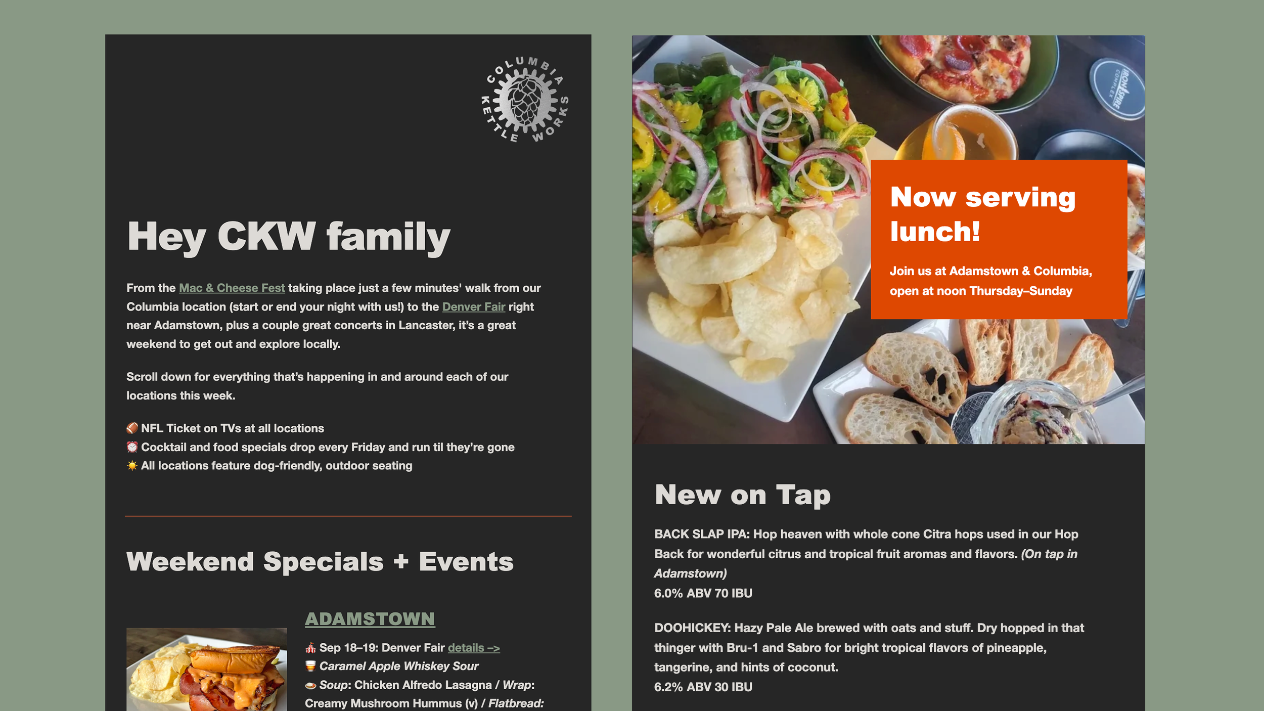
The brand refresh extended to email communications as well, with a new format to highlight weekend specials, taplist updates, and local events near each taproom — helping the brand feel consistent while giving customers more reasons to stay connected.
See the website here.
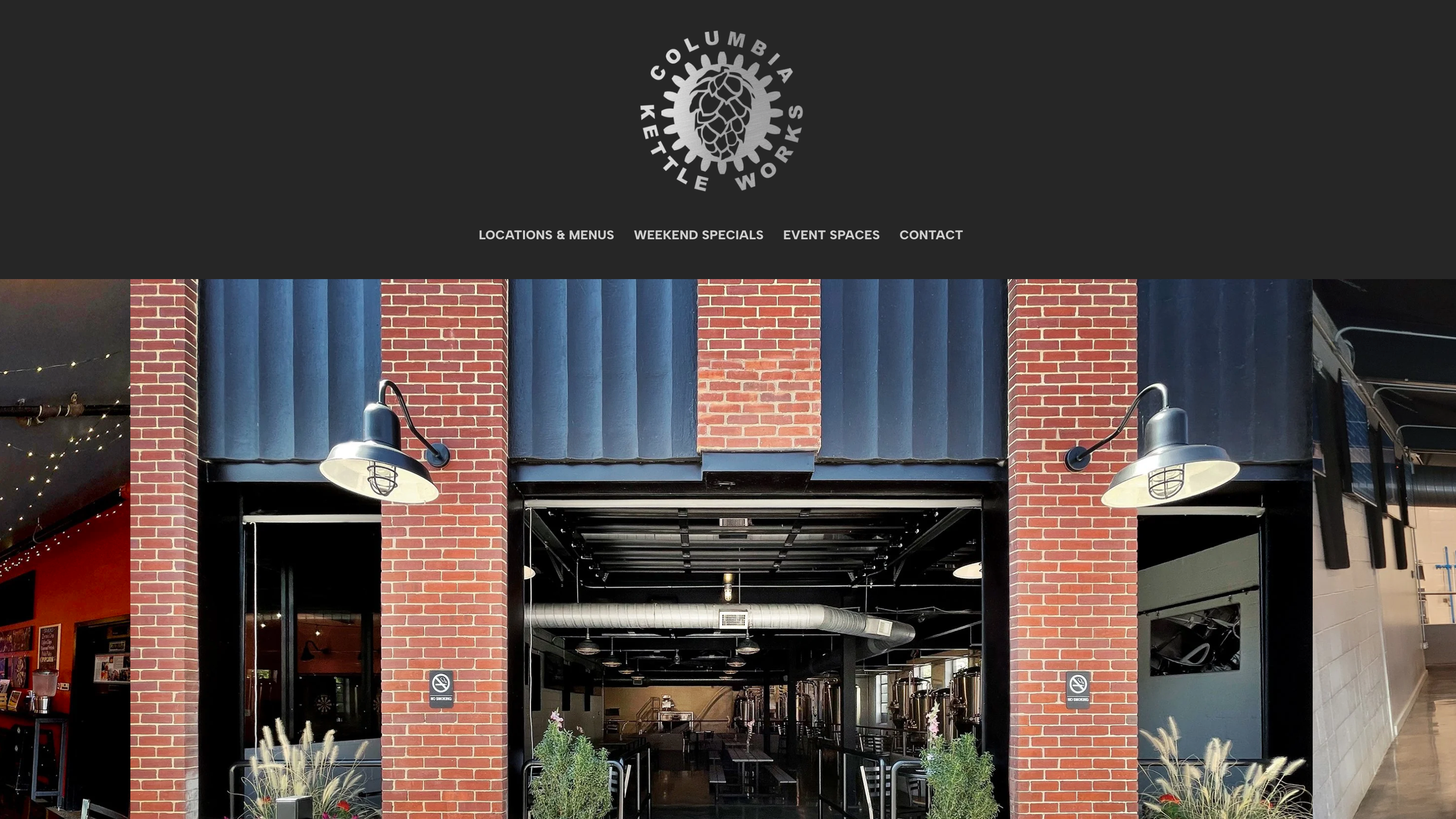
Website, photography, and color palette