BlackRock Sustainable Investing: Fossil Fuel Divestment White Paper
Making dense information more engaging
We transformed a lengthy black-and-white Word document into a vivid, organized report that made a substantial amount of information easier to navigate and more engaging to read.
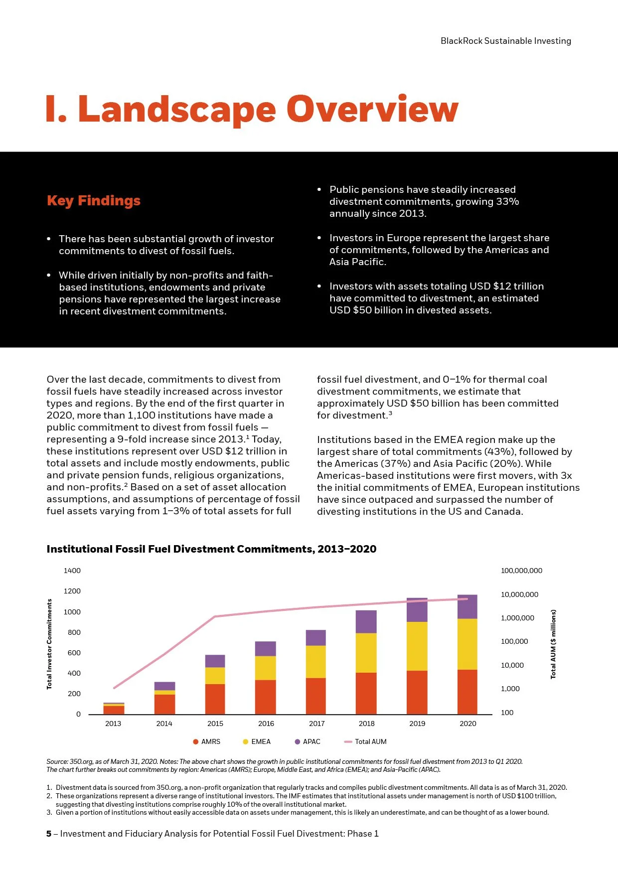
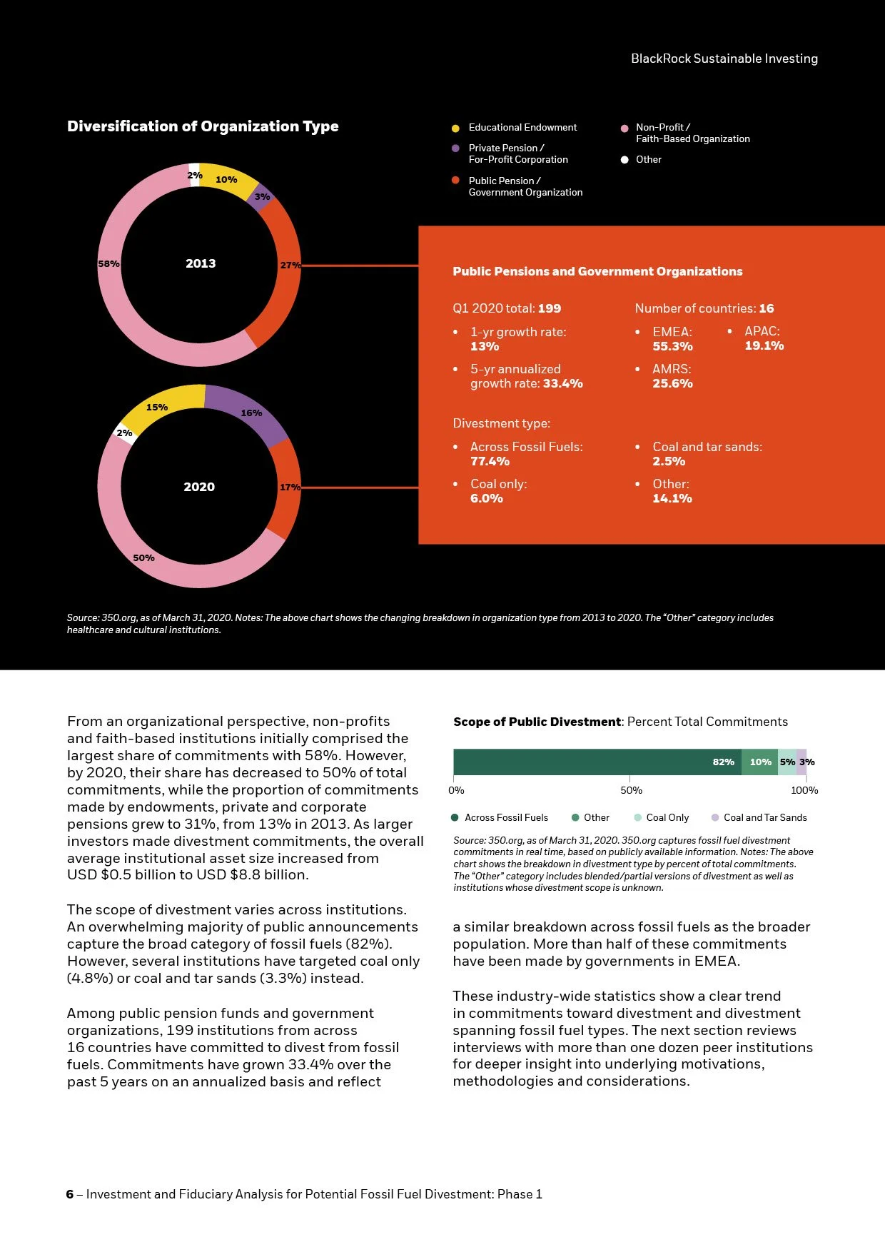
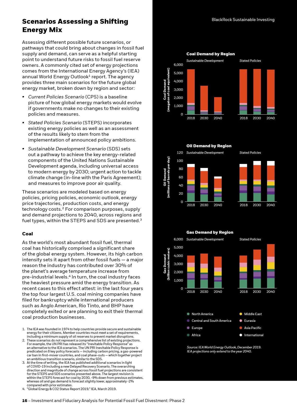
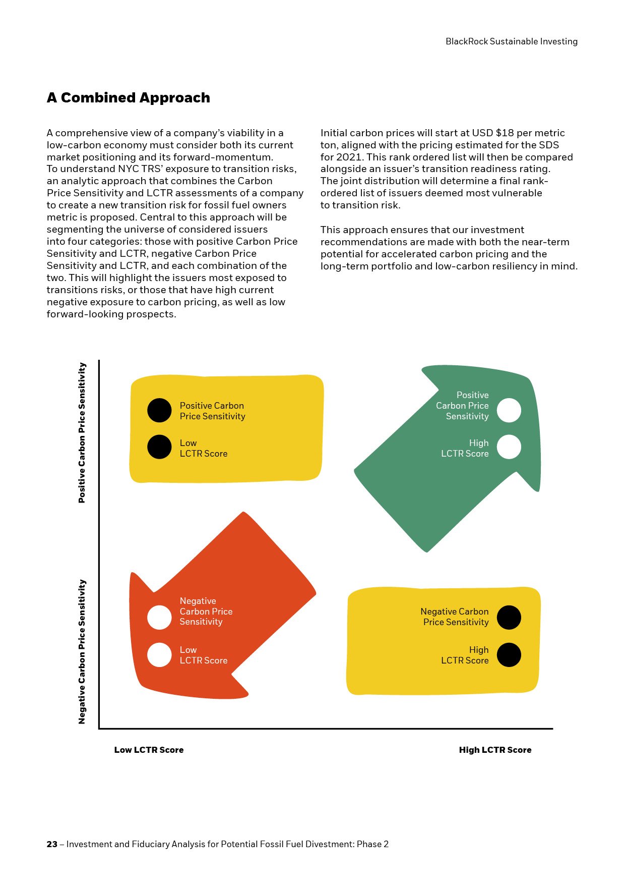
Important findings were pulled out of the dense text and reinterpreted as visual sidebars, subsections, and other graphic elements, creating variety and giving readers a clearer way into the material. Everything was designed within BlackRock’s established brand guidelines while still giving the report a distinct visual rhythm.
We paid close attention to both the words and the supporting data, making sure the design reinforced the authority of the subject matter rather than competing with it.
Whether it’s four pages or forty pages — which happened to be the case here — we pore over every detail.