Harvard Business Review publication
Making a clearer point with better data design
It’s easy to reach for Microsoft’s built-in data visualization tools. It’s harder to make sure the resulting graphic actually helps someone understand what you’re trying to say.
For Power to the Middle: Why Managers Hold the Keys to the Future of Work, each chapter required a data visualization. The project team supplied the editor with PowerPoint slides that were often cluttered, unfocused, or disconnected from the point of the chapter. Some also called for visualizations that couldn’t be created without a designer’s help.
There were physical constraints to consider, too. The book was being printed in black and white, with relatively narrow pages, and the original slides had not been designed with either limitation in mind.
We collaborated with the editor to identify the central point of each chapter and determine how the data could best support it. We then redesigned each visualization to clarify the message, work within the book’s format, and reproduce effectively in black and white.
The result was a set of visualizations that felt like part of the book rather than graphics dropped into it — helping reinforce the larger argument chapter by chapter.
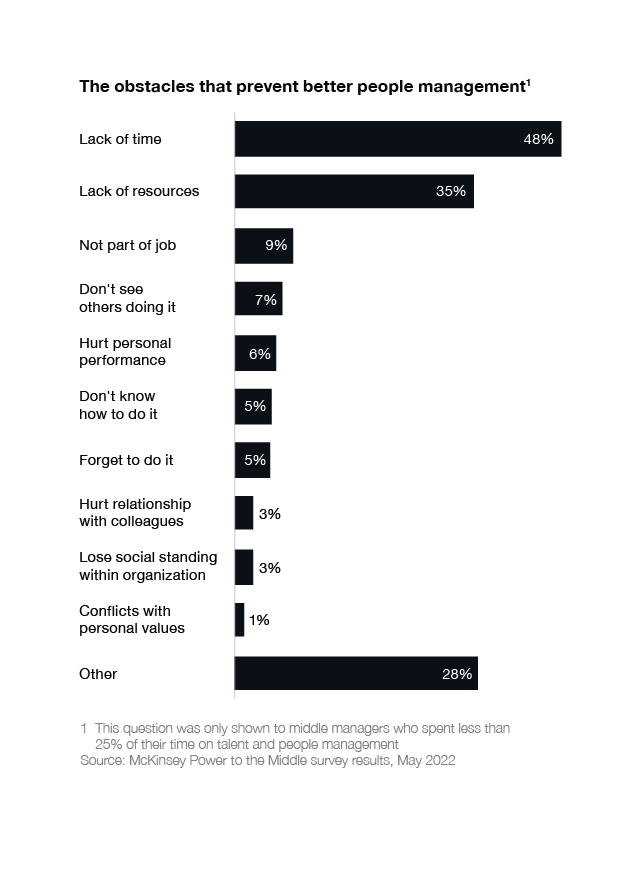
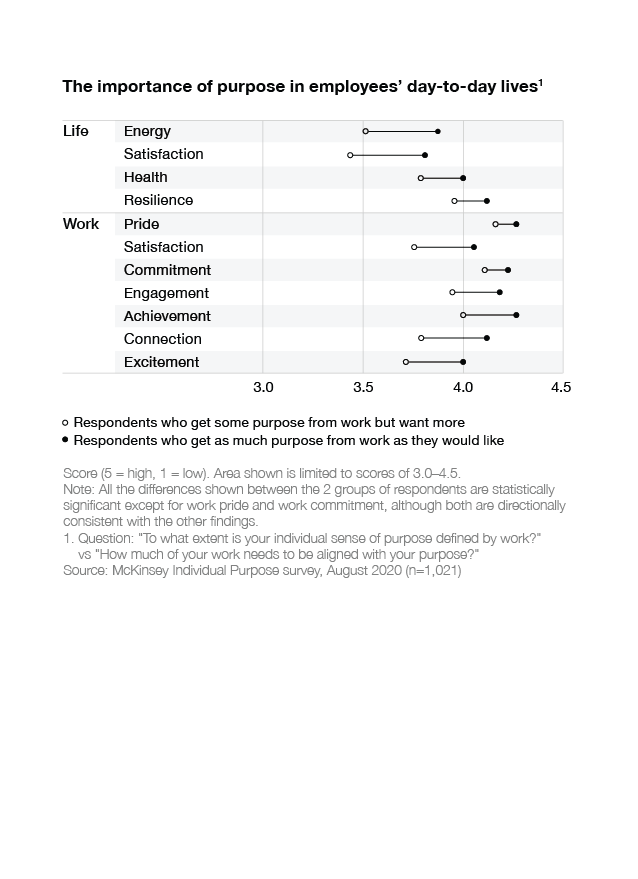
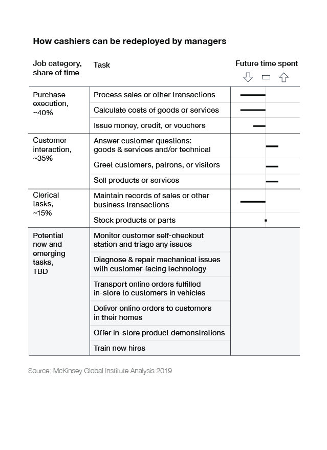
Below are samples of our data visualizations.